The Art of Name Badging
Helpful hints to avoid hearing “What’s your name again?” at your next event.
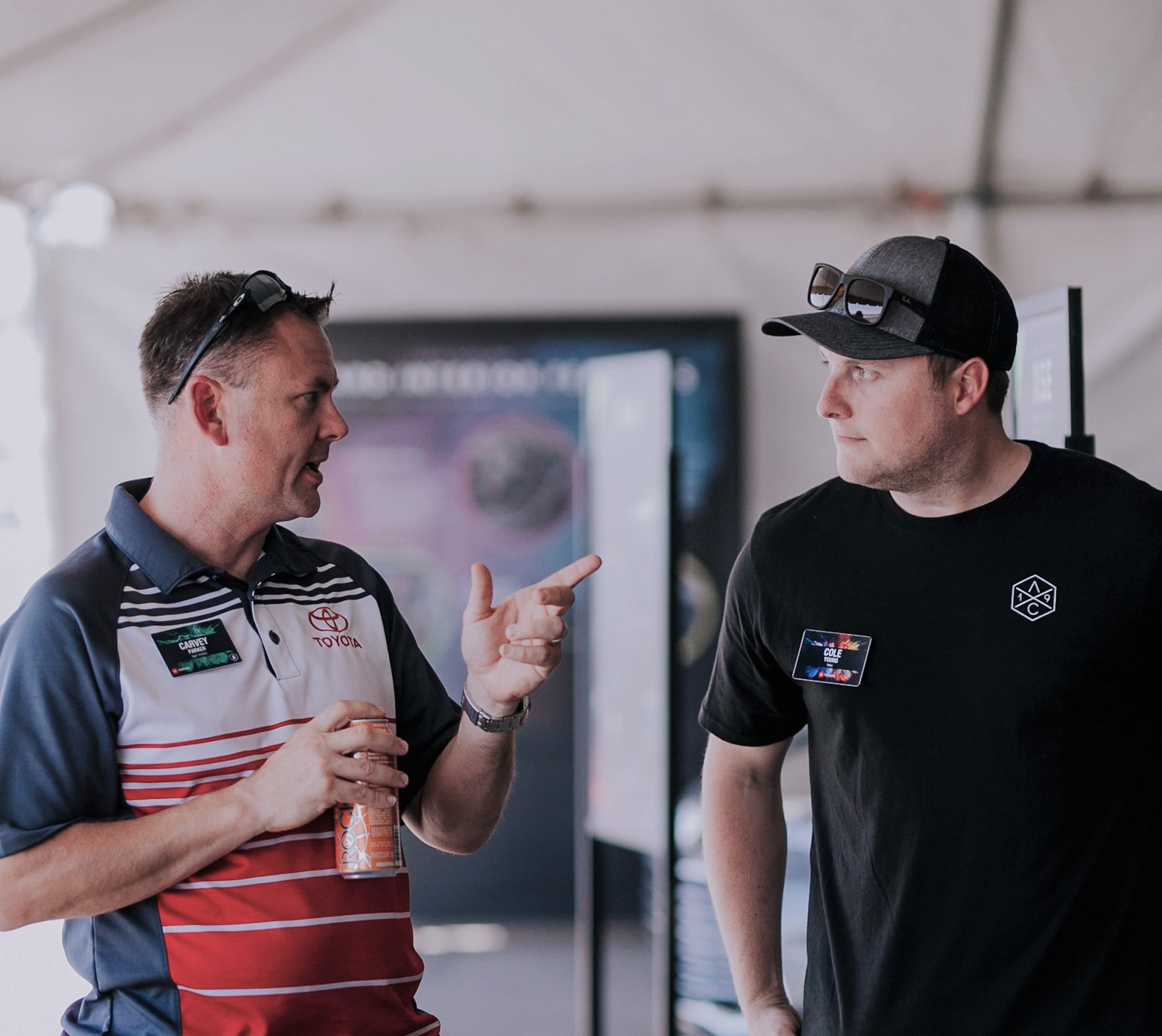
Imagine for a moment, you’re taking a quick break from the annual event conference you attend for work. As you’re milling about the snack table, you notice a familiar face on the other side. Allen was it? No, that’s not it. Alex, perhaps? In between bites, you attempt to steal a quick glance at the name badge to catch his first name. The badge has its own objectives, however, as it spins, dances, and pivots every which way but facing you on its too-long lanyard. Even if the badge had been oriented towards you, the font size is so small it would require an embarrassing amount of time to read it. Defeated, you apologize and pose the dreaded question: “Sorry, what’s your name again?”
Oh, the woes of an ineffective name badge. But it doesn’t have to be this way!
A name badge can be effective and aesthetically pleasing. Plus, it can play into event/corporate branding efforts while simultaneously being functional. For this to happen, though, careful considerations need to be made during budgeting and design phases of this crucial event piece. Name badges should never be an afterthought, given that poorly executed badges can result in awkward and uncomfortable encounters (like the one mentioned above).
What should you consider before printing your next set of name badges?
While budget is a huge consideration—one that so many design choices hinge on—we won’t be treading down that path today. There is a myriad of shapes, sizes, materials, colors, and an even greater number of corresponding price ranges for name badge components. You can spend a lot or a little; it’s totally up to you.
With that out of the way, let’s clear the next hurdle: design. If someone who is not a graphic designer absolutely had to create a name badge, we suppose he/she could. But, is a legitimate, professional graphic designer going to do a better job? The answer is yes, without a doubt, and likely in less time, too. Involving a professional graphic designer will certainly improve the overall look and vibe of your name badge, but there are a few other factors to keep in mind during the design phase as well. Let’s explore them, shall we?
Font and Size
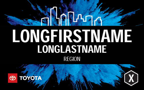
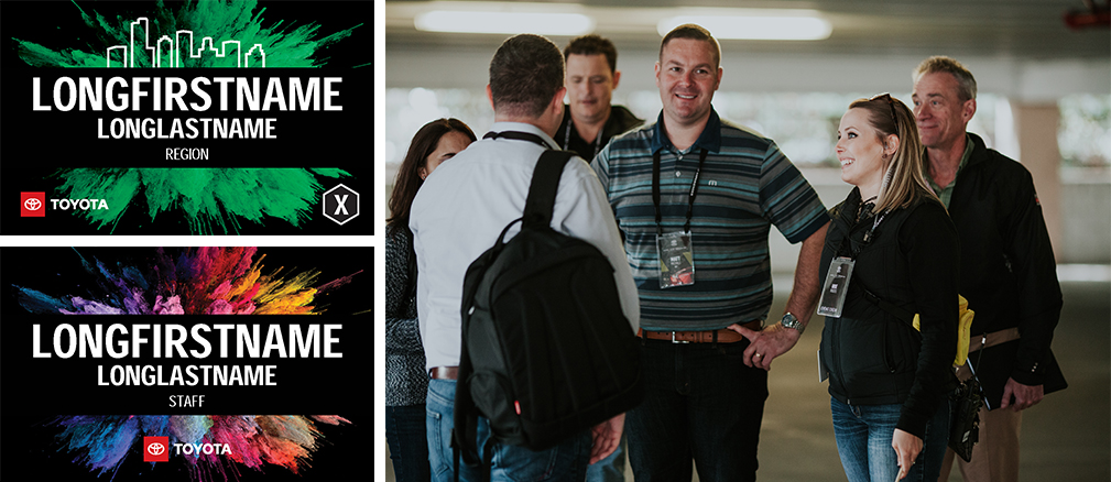
You’ll want to steer clear of fanciful, fun, and playful fonts. A name badge is not the time, nor the place, for experimental or edgy fonts. Use the largest font allowed within the confines of your name badge’s space. Since most names aren’t longer than 13 letters, we like to use the placeholder “LONGFIRSTNAME.”

Color Contrast
Correct Spelling
Personalized Information

Staff vs. Guests

Subgroups
Lanyard Attachment Points
Receptions and Mixers
How do I know if I created an effective name badge?
As you go through the process, the following questions can provide a fundamental baseline for your name badge’s effectiveness:
- Can the attendee’s name/info be easilyread from a distance? What about in low light?
- Does it keep the correct orientation of facing outward (as often as possible)?
- Is the aesthetic design well-balanced and functional? Does it properly represent the brand and/or event?
- Will guests/participants be comfortable wearing it for an extended period of time?
The last point is quite possibly the most important aspect of designing and building out your event name badge: always be considerate of your guests’ clothing and how comfortable wearing it will be. In other words, swap out safety pins for magnets and avoid any materials that could be itchy, cumbersome, or leave residue on clothing. The goal is for attendees to want to wear their name badges, so please avoid giving them cause to just stuff it into their purse or pocket.